Ready to Start?
Exterior Update on a Budget
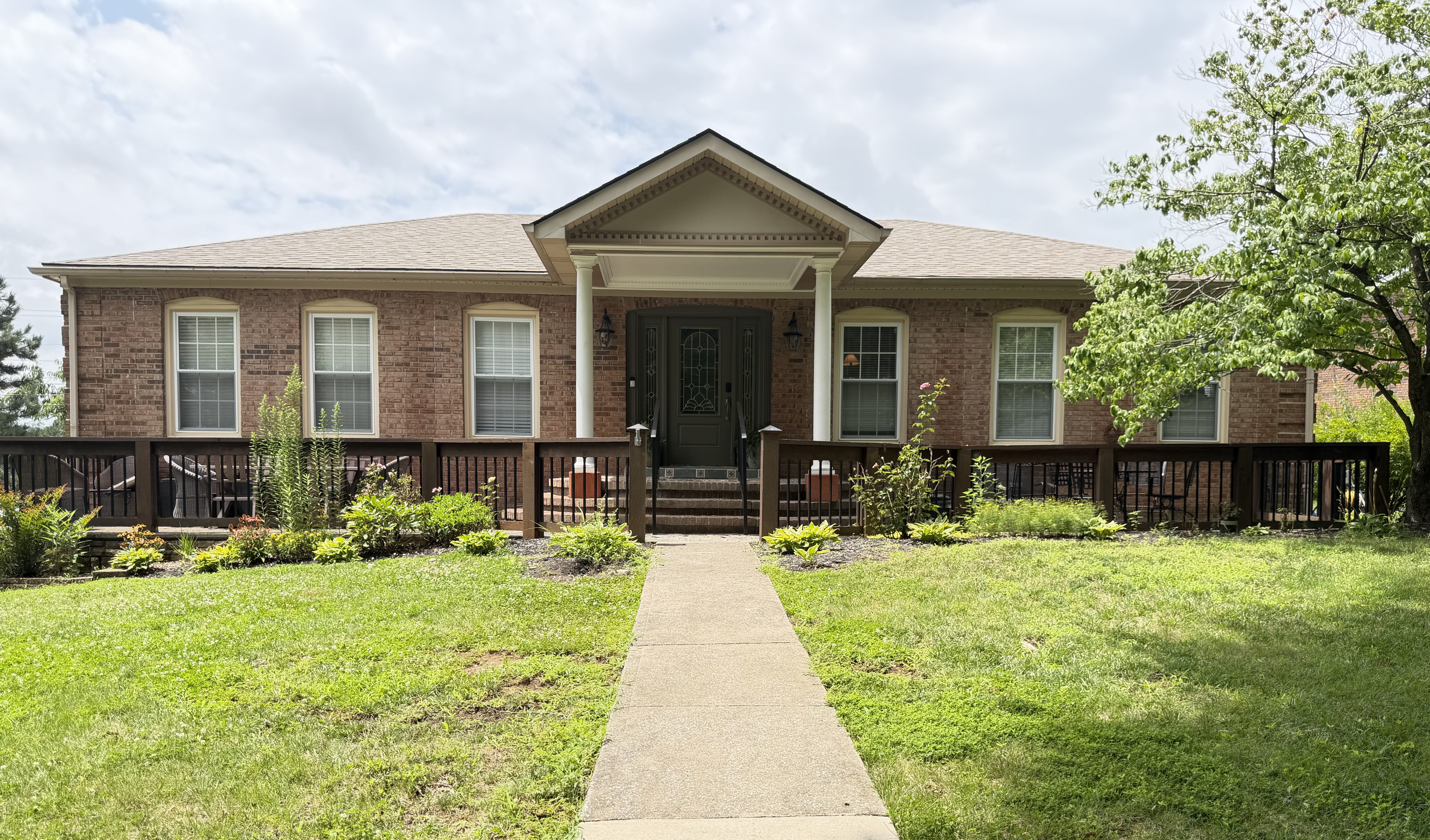
The exterior. Such a daunting space to think about. I love the idea of gardening and landscaping, beautiful front porches and perfectly placed plants but these are not my forte. It’s a growth opportunity and another area where we can bring more beauty and updated personality where we can for now. There is something impressive about the house and how it looks like a sprawling ranch with lots of room. Someone did care a lot about the landscaping in a previous era and it has helped to add some order to the large corner lot.
The front porch is kind of epic. We’ve enjoyed having so many options for seating and eat dinner out here frequently. I pretend its a Tuscan patio. It needs a big overhaul, it’s all made of concrete and tile which is slowly crumbling away. And the door… that is one expense it is hard to fathom shelling out money for but man, does it age the house.

Here was our first hint at the Roman-Greco influence when we first saw the house. So many columns, such tile, bountiful molding- more to come inside.
I decided I’d first like to see what it looked like without shutters. Jeff went to work, battling wasps and being a hero. This step definitely simplified the look and made the house look longer and larger.

My goals in painting the front door were to help the 1980’s detail of gold metal and beveled glass disappear and to find a place for the eye to rest onto something soft. I was inspired by In Honor of Design’s front door upgrade. It was moody but timeless. I went to our leftover paint shelf and picked a few to try out first. There was a gray-green but it was too light and seemed more like a color when I was really going for a neutral. So then, I made the mistake of just buying the paint color Anna used in the inspiration and figured it would work because it worked for her on a varied brick house. It didn’t. It just looked straight up black; and with the yellow-gold metal in the glass it looked like Halloween decor. I was embarrassed, didn’t even document with a photo even though it stayed on my door for a few days.
Finally, I remembered some design advice I heard somewhere. Choose the darkest color of brick and match your paint to it so everything feels cohesive and purposeful. Genius.
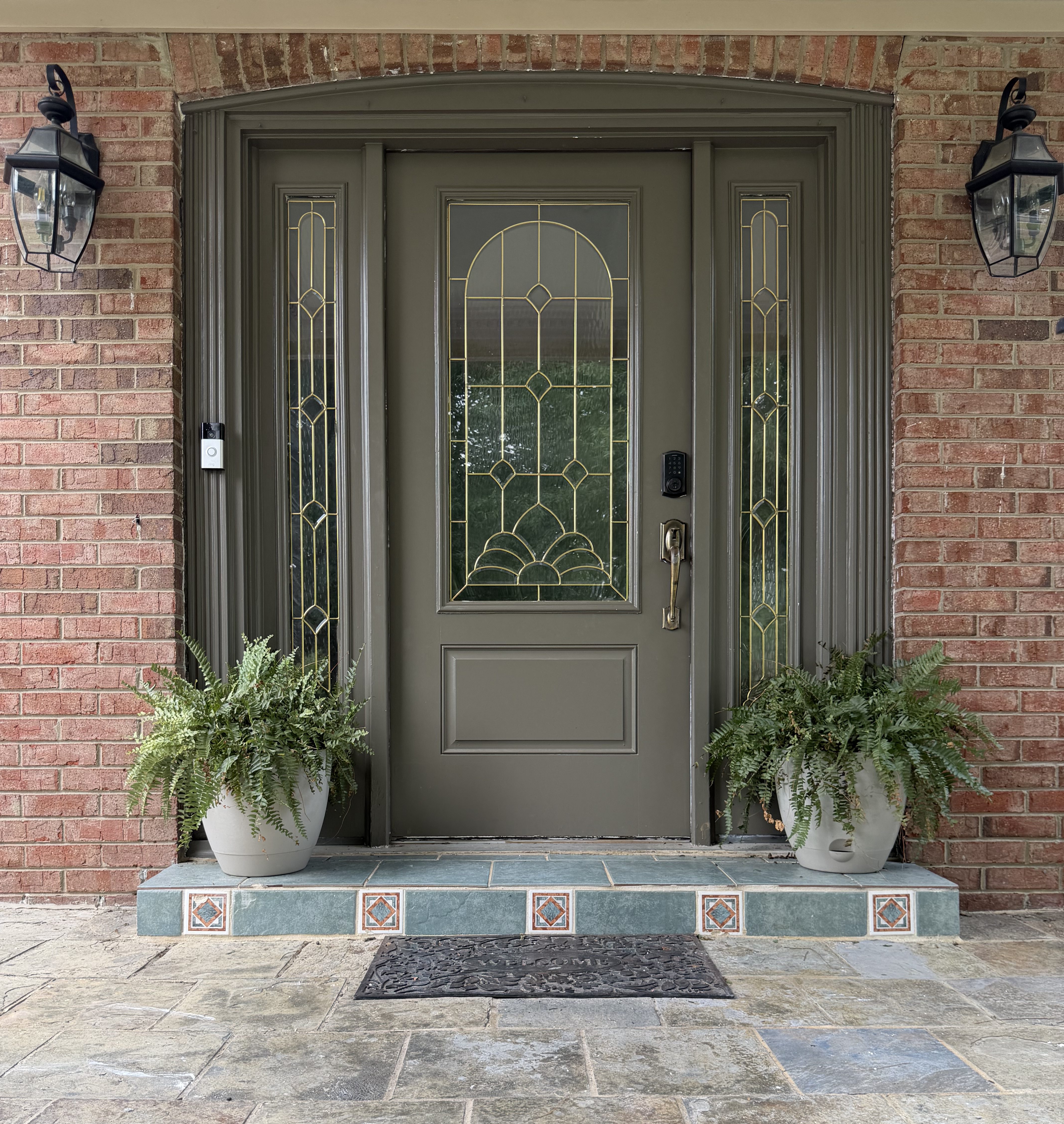
I think it does a lot for the exterior. It can’t do everything… there are still green tiles to compete with and about 5 other accent colors. But the gold blends in. I thought about replacing the door hardware because it’s quite worn but the burnished bronze actually adds some warmth where a different tone of gold or the harshness of matte black could’ve been distracting.
So there. Another simple step on the long road that makes a house feel more like our home!